Have you ever wondered, okay cursed about, why your printed product doesn’t match what you see on the screen? It’s the acrimonious acronyms that are to blame; namely CMYK -vs- RGB. Later on we’ll also discuss the Pantone Matching System known as PMS (another acronym enters the fray). But the main point here is that your monitor uses a different color model than is used in the printing process, and is probably the culprit. Let’s take a closer look at the three main color models and discover how they are built and where they are best used… and avoided.

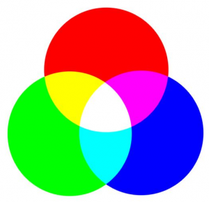
Let’s start with the color model that people encounter the most in today’s technology driven world. Monitors, phone displays, televisions, video games, image scanners and digital cameras, to name a few, use the RGB model. RGB stands for Red-Green-Blue. RGB colors are additive colors, meaning that they are created by adding colored light beams together. All of the RGB hues are created by using varying combinations of the primary red, green and blue. The intensity of colors is equivalent to the level of light. For example, lighter, whiter tones have a strong light intensity. The darkest colors have zero intensity. When all three colors are added at a density of 100%, they produce white. Conversely, when all three colors are at 0% density, they produce black. A simple example is when you close your eyes you remove the red, green and blue light beams (near 0% density) and you see black. Because your computer screen emits light instead of reflecting it, it uses this model. One important thing to note, in order to answer our initial question, is that the color spectrum of RGB is greater than that of CMYK. Meaning more colors are available to it.
When designing for the web, you should only use RGB colors. It is important that you realize that color differences between monitors can also make things confusing. The monitor you use can make an image look brighter or darker than it would look on another screen. Therefore, the printed product could vary from your expectations even more.
The next color model we are going to look at is CMYK. CMYK stands for cyan, magenta, yellow and key (black). The CMYK color is often referred to as the four-color process, because it uses four colors to create a wide range of hues with approximate print results. You can see how a color photograph is broken down into the CMYK model in the example below.

CMYK colors are subtractive colors, meaning that they work by subtracting some wavelengths of light reflected off of white paper, but not others. The absorbed (subtracted) colors are not visible, while the unabsorbed colors remain visible. Each of the four colors in the CMYK model absorbs a complementary color, preventing the complementary color from being visible. Cyan controls the amount of red you see. Magenta controls green visibility, and yellow controls blue visibility. The black ink is included to enhance the sharpness of an image and to cover up registration errors.
CMYK is the most commonly used color printing process. It provides the greatest accuracy when printing photographs, and is best for any print design that uses four or more colors. However, some tones don’t translate well to the CMYK color space, including metallic colors, neon or fluorescent colors, and orange. Because of this and the color gamut being smaller than RGB, the printed product may indeed end up looking different that what you see on a screen.
The last color model that is part of this discussion is Spot Color, or more specifically the Pantone Matching System; the printing industry standard. The Pantone Matching System (PMS) is a standardized, organized system that allows colors to be reproduced accurately and consistently. Designers often use PMS colors because they don’t need to be mixed. Each one already exist as a set color with an allocated number, which allows for reliable results.
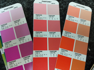
A Pantone color is a “spot color.” Rather than mixing colors the way CMYK does (example: 4% cyan, 84% magenta, 100% yellow, 0% key) the Pantone color prints as the exact color you need. Most of the Pantone colors lie beyond the reach of CMYK, but Pantone can convert an image to either CMYK or RGB, depending on whether it will be applied to web or print. The picture below is a Pantone Color Bridge chart the shows the nearest CMYK equivalent to specific spot colors. You can see the differences between the left and right swatch of each color. The left is the actual PMS spot color and the right is the best CMYK match.

Why am I showing you this difference? To make the point that for logos or brand coloring that must be consistent, Pantone is the best choice because the color of the finished product will be the exact one you choose. Pantone is also the best option for black and white printing or monochromatic designs. The Pantone system can produce special colors that CMYK can’t produce. Therefore, the system can be used to correct limitations of CMYK, such as the inability to produce fluorescent colors or metallic colors.
If your printer is capable of printing more than 4 colors (almost all are) and you can afford the added cost, then printing CMYK with added spot colors for the colors that must match may be your best choice. For example, CMYK for photos and full color graphics with 3 spot colors added to match logo colors exactly.
I hope this discussion helped you better understand the way the color models work and how you can make them work for you. We borrowed some technical explanations directly from an article by Signazon. You can read the original article here.

